Font Fight!; U-Bahn Font; The Ultimate Oldschool PC Font Pack
Free fonts galore in today’s typography-centric edition of the Drop.
TL;DR
(This is an AI-generated summary of today’s Drop using Ollama + llama 3.2 and a custom prompt.)
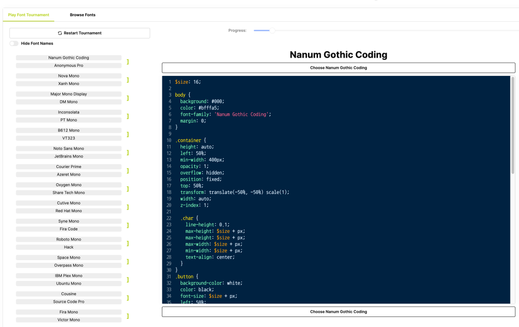
Font Fight! offers an interactive platform to find the ideal coding font through side-by-side comparisons (https://www.codingfont.com/)
The U-Bahn font project aims to create an open-source font based on Vienna’s U3 line digital displays (https://github.com/gheja/wu3-segments/)
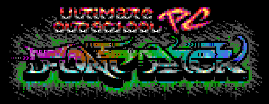
The Ultimate Oldschool PC Font Pack provides pixel-perfect remakes of vintage PC text mode fonts in modern formats (https://int10h.org/oldschool-pc-fonts/)
Font Fight!
Coding Font is a fun, interactive platform designed to help us find our ideal coding font.
It offers a gamified experience to help us discover the perfect coding/terminal font (if such a beast truly exists).
To play, you compare different fonts side-by-side to ultimately help decide the “winner”.
While you’re there, also check out their coding font blog!
U-Bahn Font
I’ve never been on the U-Bahn, but a recent project (link below) caught my attention, and caused me to poke at it a bit due to the typography choices the made by the transport agency.
It turns out that the typography used on the Vienna U-Bahn, particularly on the U3 line, is a deliberate, thoughtful component of the system’s visual identity and wayfinding design. A custom sans-serif typeface is employed throughout the network, characterized by clean, geometric letterforms with consistent stroke widths and open counters (fancy term for the enclosed spaces in letters like ‘a’, ‘e’, and ‘o’). These features enhance legibility across various sizes and distances, helping passengers quickly process information in a fast-paced metro environment.
The U3 line designation features a distinctive typographic treatment. The letter “U” is typically set in a bold, sans-serif font, with the number “3” placed next to or slightly below it. This “U3” combination is often enclosed in a colored square or circle, using the line’s official orange color. This was also a deliberate design choice to help passengers rapidly identify the line and distinguishes it from other signage information.
Station names on the U3 line, as well as other lines in the system, are usually set in all capital letters using a bold weight of the system font. They are displayed in large, easily readable sizes on platform signage and inside trains, further aiding passenger navigation.
Color coding complements the typography to reinforce line identification. The consistent use of the U3’s orange color appears in the background of line designations, wayfinding elements like directional arrows, and on line maps and informational graphics. This consistent color usage enhances visual coherence and aids in distinguishing the U3 line from others.
In addition to static signage, many U3 stations feature digital displays that utilize a similar sans-serif font to maintain consistency. These displays often employ high-contrast color schemes—such as white or yellow text on dark backgrounds—to improve readability.
The digital displays captivated Gabor Heja, who started a project to create an open source font based on these designs. The LCD segments in the font are based on my Gabor’s own works (i.e., photos taken on subway stations), and he gives credit to various folks who’ve helped capture images of different letters.
The font is not yet complete, but it’s super fun to watch this effort come together.
The Ultimate Oldschool PC Font Pack
This section goes out to fellow nerds of a certain, simpler era.
If you’re speed-reading past this section, please at least take a moment to select the “artwork” at the bottom of the page of the link, below, to revel in how it was crafted. Tis a thing of beauty.
The Ultimate Oldschool PC Font Pack is a meticulously crafted collection of pixel-perfect remakes of text mode fonts from vintage PCs and compatible systems, converted into modern TrueType and bitmap formats. Concentrating on hardware and firmware character sets originally embedded in ROM chips on system boards and graphics cards, the collection hopes to preserve the authentic typography of early PC text modes.
The fonts are available in several variants to cater to different needs:
‘Px’: TrueType fonts with pixel-perfect outlines, maintaining the exact design of the original pixels.
‘Mx’: TrueType fonts with embedded bitmaps, combining scalable outlines with bitmap data for precise rendering at specific sizes.
‘Ac’: Aspect-corrected TrueType fonts adjusted to replicate the original non-square pixel ratios of old display hardware.
‘Bm’: Bitmap-only formats suitable for environments where vector data is unnecessary or unsupported.
There are two character set options:
‘437’: Contains the original 256 characters from IBM PC Code Page 437, offering the classic DOS character set.
‘Plus’: Features extended character sets with approximately 780 glyphs, accommodating a broader range of characters and symbols.
The glyphs are designed to look best at their original pixel sizes or integer multiples. The aspect-corrected versions are particularly significant for reproducing the unique non-square pixel ratios characteristic of early display technology.
The collection includes detailed usage notes for Windows, web applications, and working with DOS/CP437 text files. The collection is regularly updated and boasts over 200 font families as of version 2.2.
FIN
Remember, you can follow and interact with the full text of The Daily Drop’s free posts on Mastodon via @dailydrop.hrbrmstr.dev ☮️
https://dailydrop.hrbrmstr.dev/2024/10/01/drop-538-2024-10-01-typography-tuesday/
