
读过《The Non-Designer's Design Book》 🌕🌕🌕🌑🌑
本书最大优点是创立了C.R.A.P.这个系统,对新手很友好且具有操作性,最大的缺点是作者对某些花里胡哨的字体蜜汁喜欢,品味有待提高。
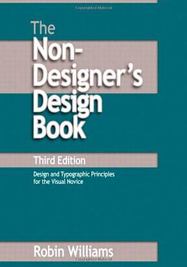
Book
The Non-Designer's Design Book
Douban Goodreads Skybridge
[美] Robin Williams
publishing house:
Peachpit Press
2008
- 2
Robin Williams provides a practical introduction to the classical principles of design in this pamphlet-sized book. Her discussion of layout is organized around four basic design principles: Contrast, Repetition, Alignment and Proximity. Each is presented in its own chapter with plenty of you-can-do-it-at-home examples. The typography section explains the principles of Concord, Conflict and Contrast, based on Williams'classification of type faces by style (Oldstyle, Modern, Slab Serif, Sans Serif, Script and Decorative), weight (Light, Bold), Shape (Narrow, Wide), and spacing. A discussion of color is notably absent; the roots of this book in early grayscale Macintosh computing show through.
Williams's book should hit the mark for amateurs creating one-page designs such as simple web sites, brochures or business cards. Set aside an hour or two to read it and do the exercises, and your designs should improve immensely. Mine have.