字体
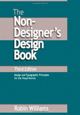
The Non-Designer's Design Book
Douban Goodreads Skybridge
[美] Robin Williams
publishing house:
Peachpit Press
2008
- 2
Robin Williams provides a practical introduction to the classical principles of design in this pamphlet-sized book. Her discussion of layout is organized around four basic design principles: Contrast, Repetition, Alignment and Proximity. Each is presented in its own chapter with plenty of you-can-do-it-at-home examples. The typography section explains the principles of Concord, Conflict and Contrast, based on Williams'classification of type faces by style (Oldstyle, Modern, Slab Serif, Sans Serif, Script and Decorative), weight (Light, Bold), Shape (Narrow, Wide), and spacing. A discussion of color is notably absent; the roots of this book in early grayscale Macintosh computing show through.
Williams's book should hit the mark for amateurs creating one-page designs such as simple web sites, brochures or business cards. Set aside an hour or two to read it and do the exercises, and your designs should improve immensely. Mine have.

字体故事
Just My Type Douban突然之间,人们就对字体着了迷。
从无处不在的 Helvetica,到爱恨交织的 Comic Sans;
从与世长存的 Baskerville,到昙花一现的 2010 Headline;
从披头士字母 T,到莉莉·艾伦的字母 L;
从 IBM 的打字「高尔夫球」,到孩子们 的「约翰牛印字套装」;
从古登堡的第一款字体 Texura,到乔布斯的第一台 Macintosh。
这些故事传奇,《字体故事》都将为您一一呈现。
这几乎是第一次,我们将西文字体的故事完整地引入到中文世界。在书中,我们努力将这些西文字体的美丽之处呈现给您。同时,我们对中文字体排印的努力也未曾松懈,书中的排印也有些许与众不同之处。
本书所使用字体均由「方正字库」正式授权。
TIB(Type is Beautiful)对本书的制作也给予了帮助与支持。

Adrian Frutiger Typefaces
Douban
Heidrun Osterer
/
Philipp Stamm
publishing house:
Birkhäuser Architecture
2008
- 10
The international creation of typefaces after 1950 was decisively influenced by the Swiss type designer Adrian Frutiger. His Univers typeface and the machine-readable font OCR-B, which was adopted as an ISO standard, are milestones, as is his type for the Paris airports, which set new standards for signage types and evolved into the Frutiger typeface. With his corporate types, he helped to define the public profiles of companies such as the Japanese Shiseido line of cosmetics. In all he created some fifty types, including Ondine, Meridien, Avenir, and Vectora. Based on conversations with Frutiger himself and on extensive research in France, England, Germany, and Switzerland, this publication provides a highly detailed and accurate account of the type designer's artistic development. For the first time, all of his types - from the design phase to the marketing stage - are illustrated and analyzed with reference to the technology and related types. Hitherto unpublished types that were never realized and more than one hundred logos complete the picture.

Detail in Typography
Douban
Jost Hochuli
translator:
Whitehouse, Charles
publishing house:
Hyphen Press
2008
- 7
Jost Hochuli’s concise guide to micro-typography considers everything that can happen within a column of text. The book was published first, in several languages, in 1987 and 1988. Hochuli then developed the German text, publishing it again in 2005, with Verlag Niggli in Switzerland. That new edition is the basis for our book: translating and adapting the work to English-language conditions.